Case Study 01 · Real-Time Inquiry Portal · Onity Group

I designed a real-time portal that replaced email threads with live case visibility.

A shared, live record for every loan inquiry, where mortgage clients can track progress, message teams inline, and skip the bi-weekly status meeting. The "where is my case?" emails stopped, and account managers got six hours back every week.

In development · 2026 Enterprise SaaS Interaction Design Mortgage Servicing Research-led
62%
Faster avg. case resolution
docs, messages, and status in one place
6 hrs
Saved weekly per manager
no more manual spreadsheet updates
0
Status meetings needed
replaced by live dashboards
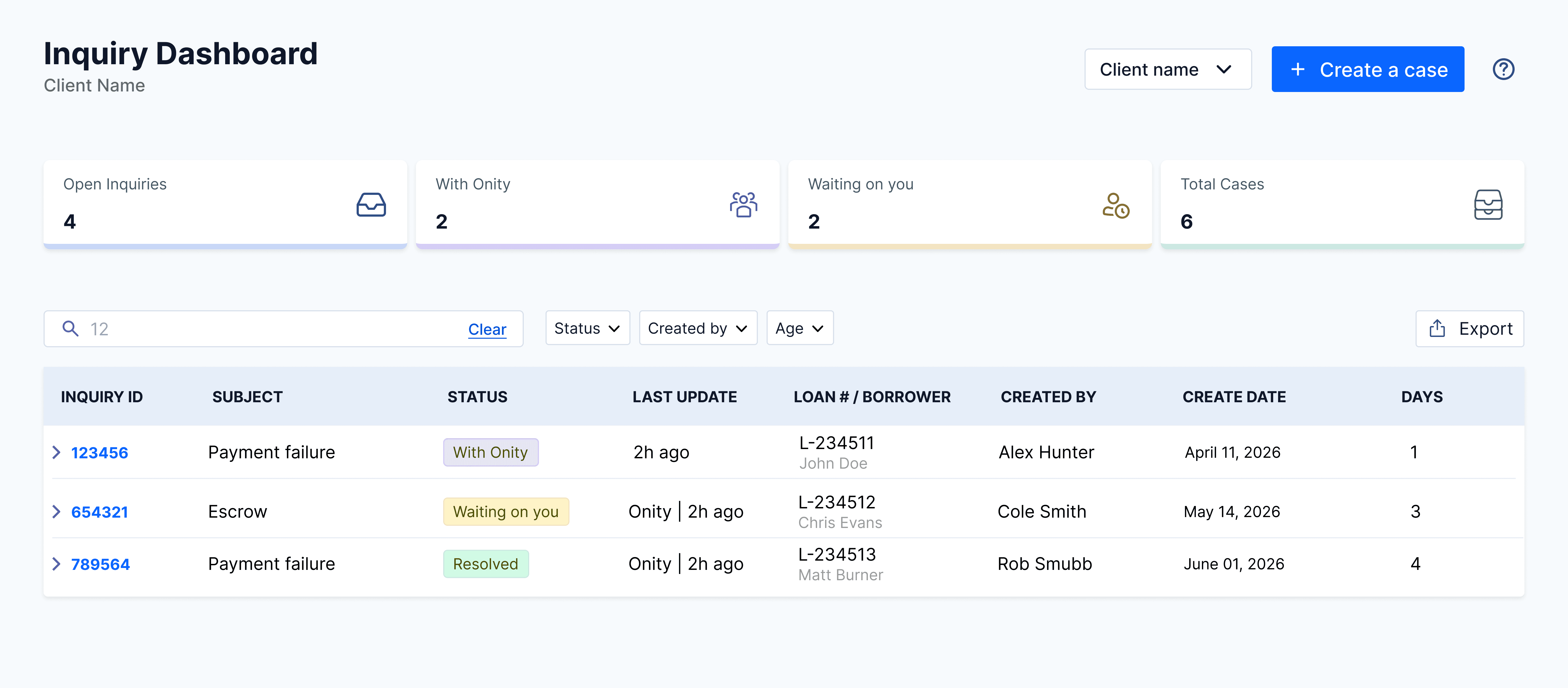
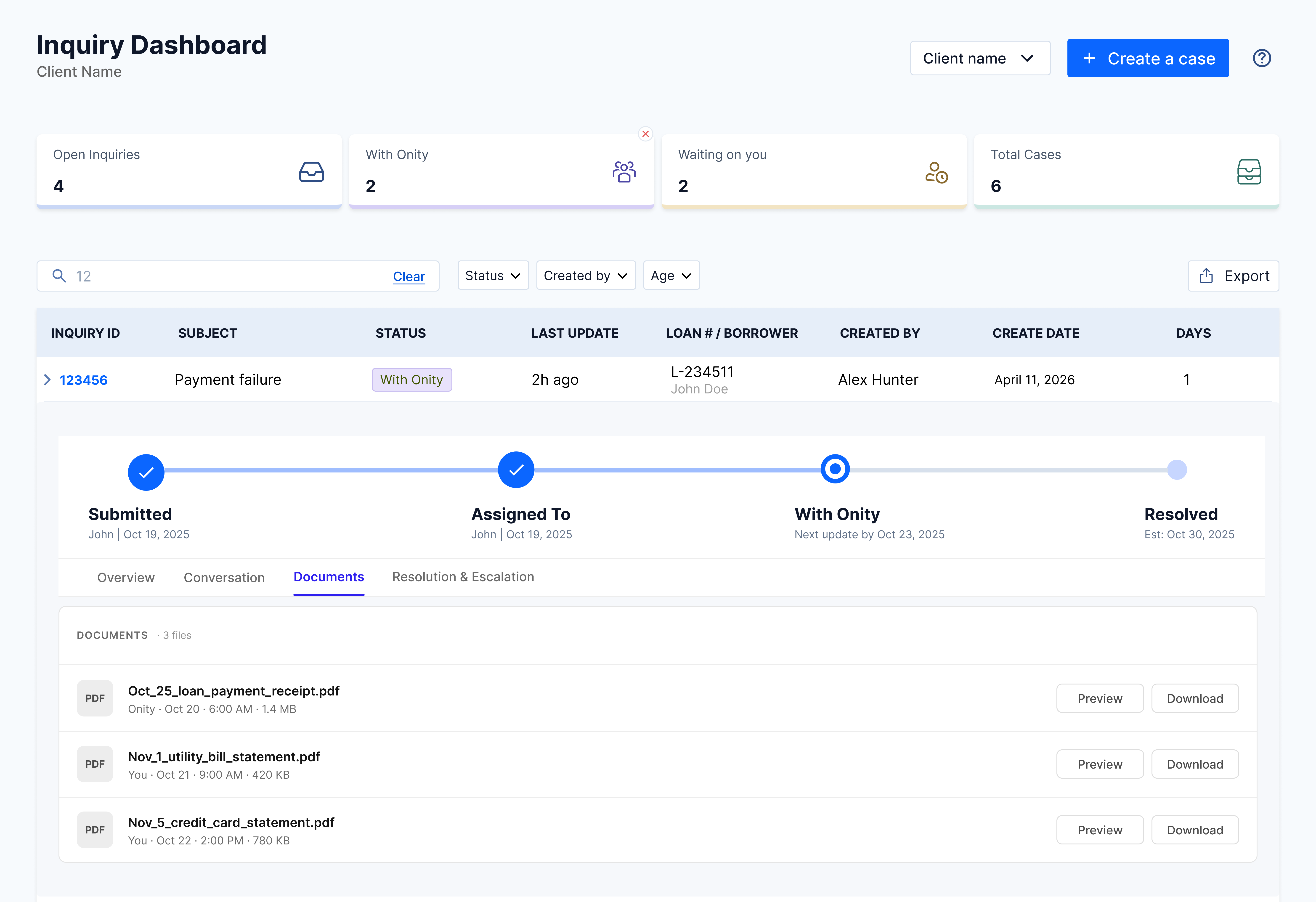
Real-Time Inquiry Portal dashboard, a central hub showing every loan inquiry in one organized, live view
A central hub, every loan inquiry in one organized, live view

Role

Lead Product Designerend-to-end research, IA, interaction, visual

Team

Onity Group1 PM, 2 engineers, 1 designer (me)

Timeline

5 monthsdiscovery through MVP build, 2026

Tools

Figma · FigJam · Mazeusability testing, prototype reviews

Note: names, workflow details, and interfaces have been modified to maintain confidentiality.
Snapshot

The short version.

If you only read three paragraphs, read these. Problem, change, and results in about a minute.

Problem

Mortgage clients had no way to track loan inquiries after submission. Updates lived in scattered email threads, and account managers burned roughly 12 hours a week chasing status by hand and running bi-weekly meetings just to stay in sync.

Change

I designed one shared workspace where every inquiry has a live record: status, threaded conversation, attached documents, and a clear resolution path. Account managers oversee their full portfolio from a filterable table; clients see exactly where each case sits.

Results

In prototype testing, 90% of users located case status unaided and no conversations were lost. Projected weekly time saved per analyst is roughly 12 hours. The MVP is in development, with a sprint-based rollout focused on the most-used tracking moves.

Problem area

Lost in the back-and-forth.

Mortgage clients and account managers needed to track every loan inquiry from submission to resolution. But after a request was sent, there was no central place to see progress, share documents, or message teams. Updates lived in hundreds of scattered email threads, and account managers burned roughly 12 hours a week manually updating spreadsheets and running bi-weekly status meetings just to stay in sync. The goal: give companies one shared record per case, pull communication out of email, and let account managers oversee their full portfolio without another meeting.

🚫

Zero visibility after creation

Once a case is opened, clients have no way to see its status or who is working on it. Without a real-time tracker, they are forced to send repetitive "just checking in" emails simply to find out if their request has moved forward.

🧵

Fragmented messaging and files

Critical messages and loan documents are scattered across individual email threads. This makes it difficult to find the latest version of a file or follow a conversation history, often leading to confusion and missed updates.

📅

Meeting-heavy status management

Because the email process is hard to track, teams rely on manually updating Excel spreadsheets and holding bi-weekly status meetings just to stay in sync. This wastes hours every week on reporting data that is often already out of date by the time the meeting happens.

"Give me the visibility to see where we sit. Show me if I'm 20% or 80% done, simple milestones or a small chart."
Ivan Camarena · Client User
"I need to see all of our open cases, not just mine, so I can cover when someone's out."
Glenda Brue · Client Administrator
Through user interviews, a clear pattern emerged: clients felt invisible after submitting a request, struggled to track shared progress, and found it impossible to manage their team's full workload. This led to a cycle of endless follow-up emails, heavy reliance on manual status meetings, and a total loss of trust in the process.
Design goals

What I aimed to achieve.

Three goals to fix the broken state: give companies visibility into what's happening with every case, pull communication out of email and back into the case itself, and let account managers see the full picture across their entire portfolio.

Goal 01

Total transparency

Give mortgage companies a clear view of their case status, key dates, and loan info so they never have to guess what is happening after they hit submit.

Goal 02

Centralized communication

Move messages and files out of messy email threads and into the case itself, making it simple for teams to stay in sync and find what they need.

Goal 03

Company-wide oversight

Allow account managers to oversee every case across their entire company and run reports, making sure they can stay in control of their full portfolio.

Solution

A central hub for real-time oversight.

One place where every loan inquiry lives, status, owner, key dates, updated in real time. The "where is my case?" emails stop, and clients can finally trust the system as the source of truth.

"Give me the visibility to see where we sit. Show me if I'm 20% or 80% done."
Ivan Camarena · Client Account Manager
Dashboard view

One screen, every case at a glance.

The entry point. Status summary cards surface aging cases at the top; the live, filterable case table replaces the bi-weekly status meeting.

"I need to see all of our open cases, not just mine, so I can cover when someone's out."
Glenda Brue · Client Administrator
1

Status summary cards

Why: Users felt ignored after sending emails because they couldn't see any progress. I added these cards so they can see the state of every case the second they log in.

It gives users peace of mind that their work is being tracked and stops them from sending constant "is this done yet?" emails.

Visual Hierarchy · Fast Feedback
Dashboard status summary cards row showing Open Inquiries 4, With Onity 2, Waiting on you 2, and Total Cases 6 counts
2

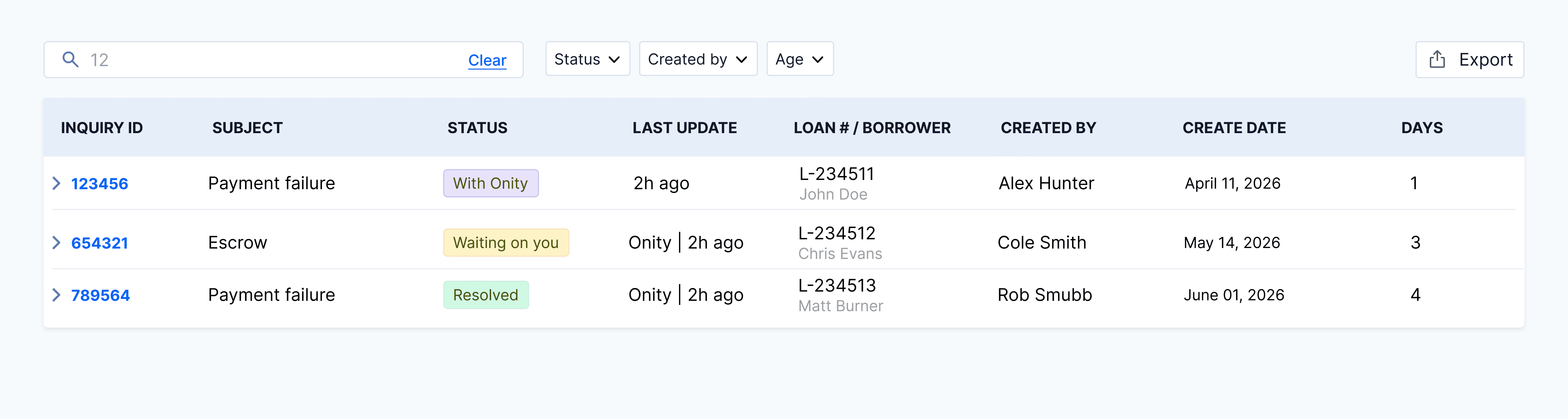
The live case table

Why: Teams were wasting 12 hours a week manually updating spreadsheets. I built this table to be the single "source of truth" for every inquiry.

It kills the need for boring status meetings. Anyone can find an answer in seconds using filters instead of digging through old emails.

Data Transparency · Recognition
Live, filterable case table with inquiry ID, subject, status chips, last update, loan number, owner, created by, create date, and days columns
Case detail view

Detailed insights and interaction.

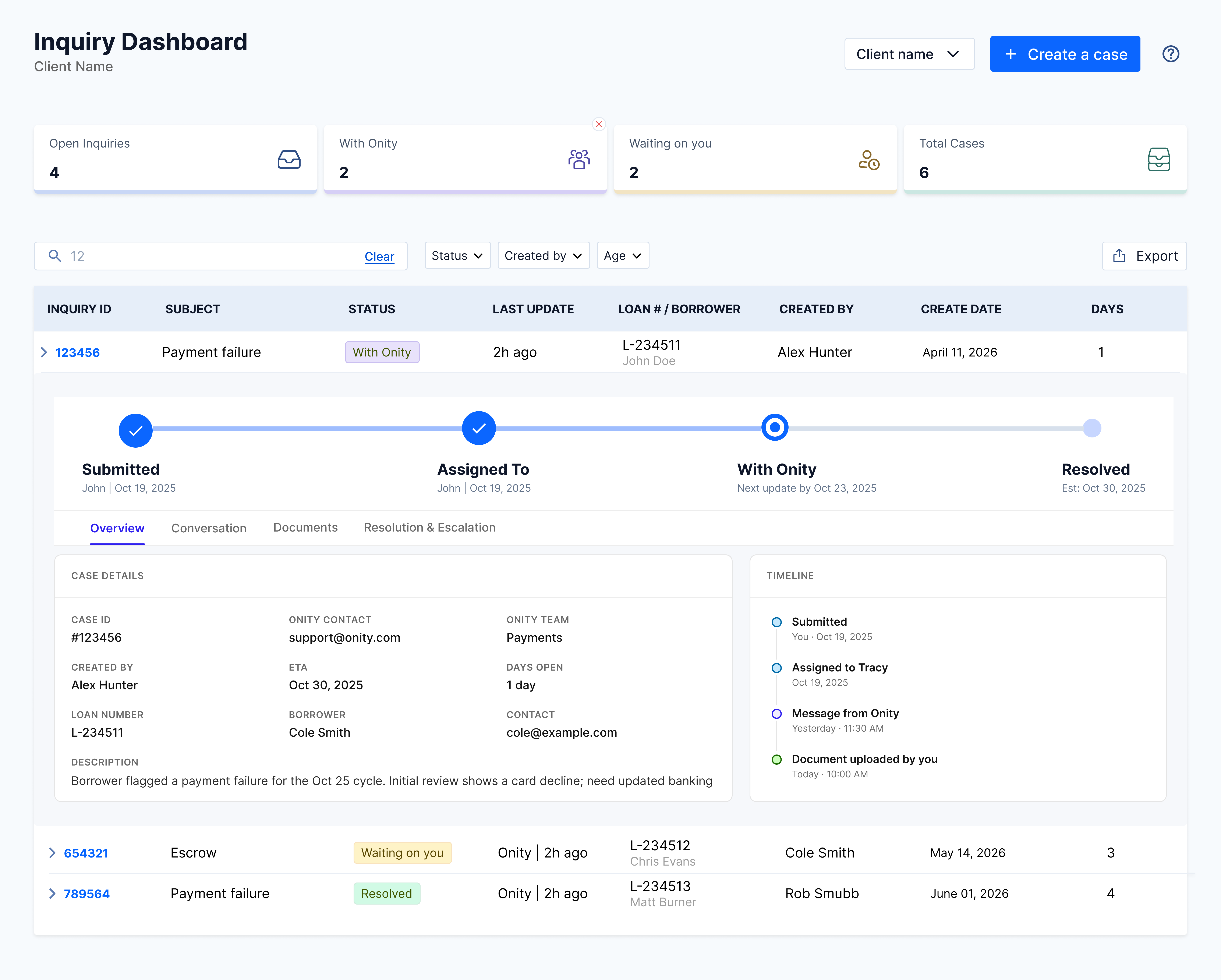
A full-page case view that puts progress, conversation, and documents in one shared history, so clients and account managers stop hunting through email threads for the latest state.

"Every case is a different email thread, finding the latest update means hoping it didn't get buried."
Synthesis · across client interviews
1

Real-time progress tracker

Why: Research showed that users need to know if a case is just starting or almost finished. I put this tracker at the top so clients can see exactly where they are in the process at a glance.

This stops clients from having to email just to ask for a status update. They can see immediately if the team is working on it or if it's their turn to act.

System Status · Visual Cues
Real-time progress tracker bar showing four stages: Submitted, Assigned To, With Onity, Resolved, each with date stamps, with tabs underneath for Overview, Conversation, Documents, and Resolution and Escalation
2

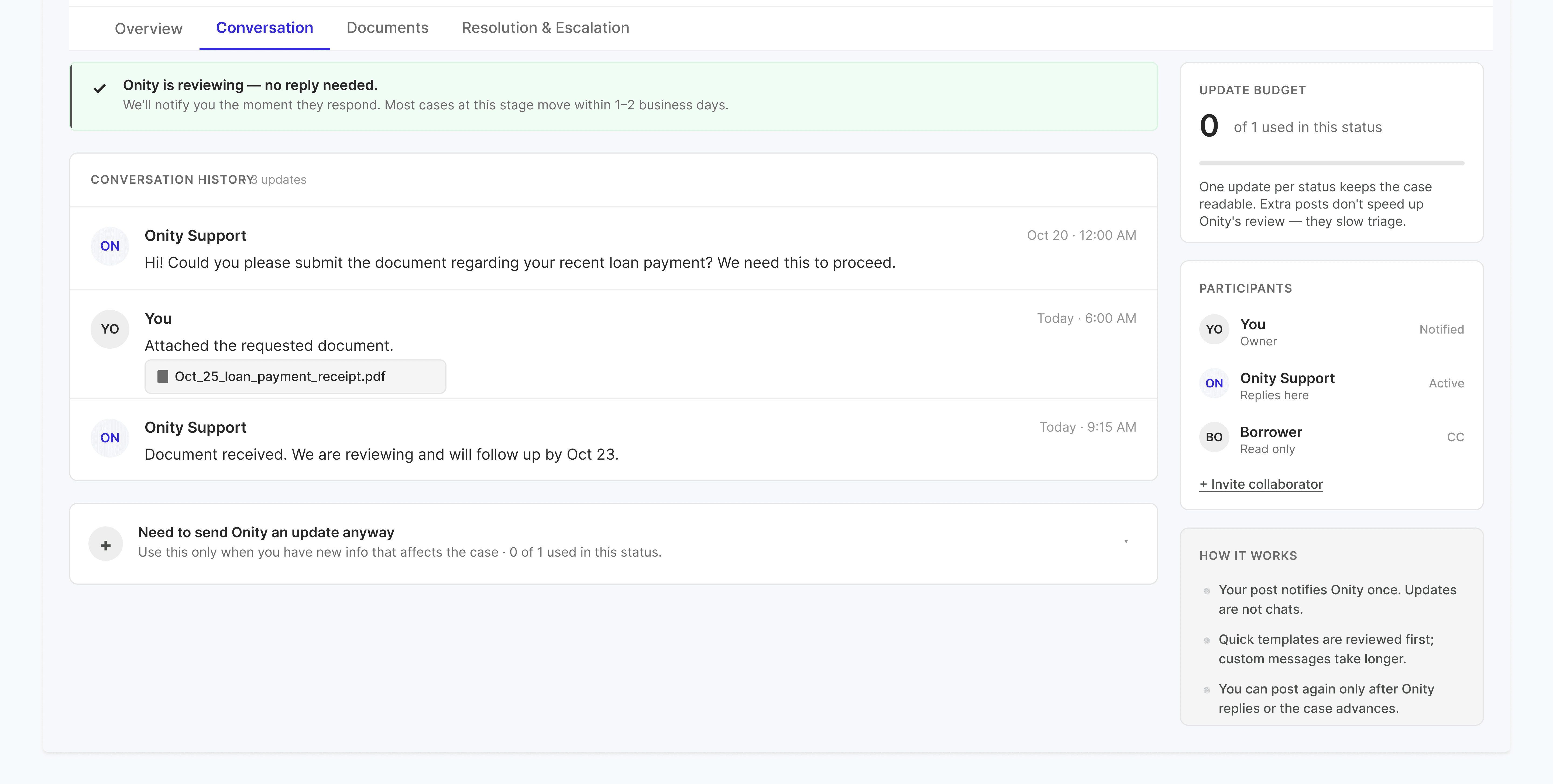
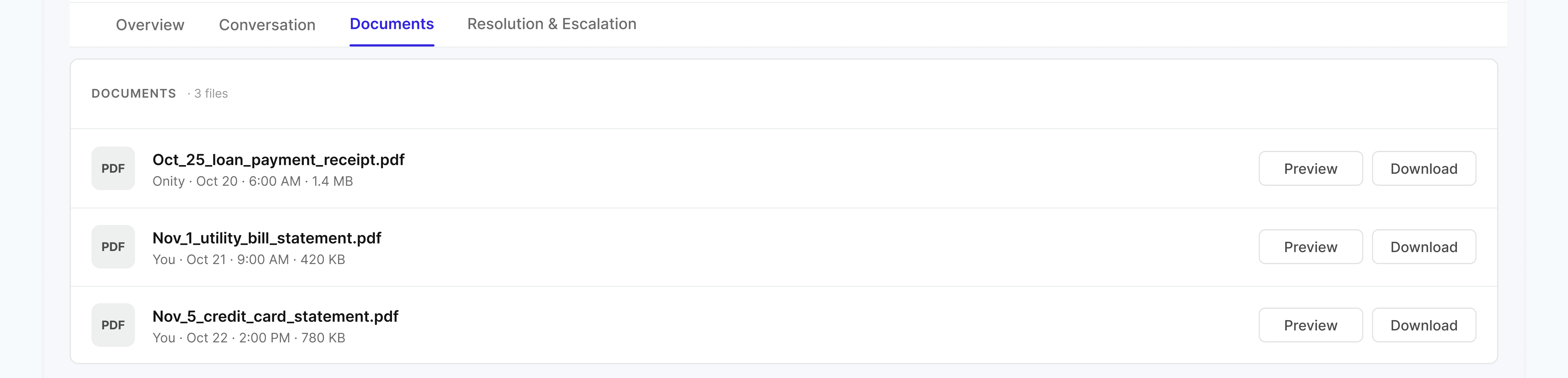
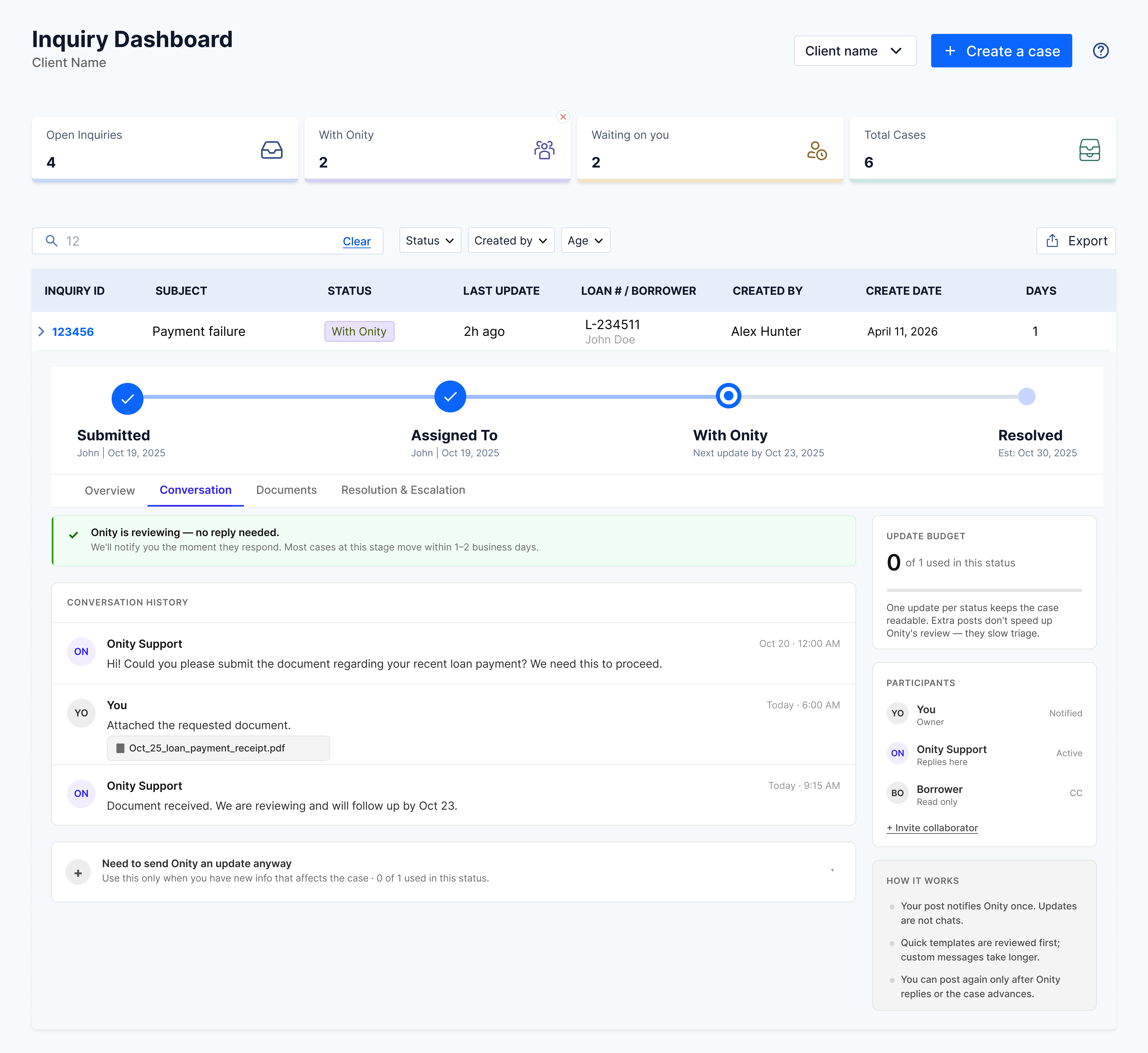
Unified messaging and files

Why: Loan documents and messages were often lost in long, cluttered email chains. I combined the chat and the document list into one view so all the context stays with the case.

This makes it much faster to find a file or read the latest message. It also helps teammates step in and help if someone else is out of the office.

Information Access · Context
3

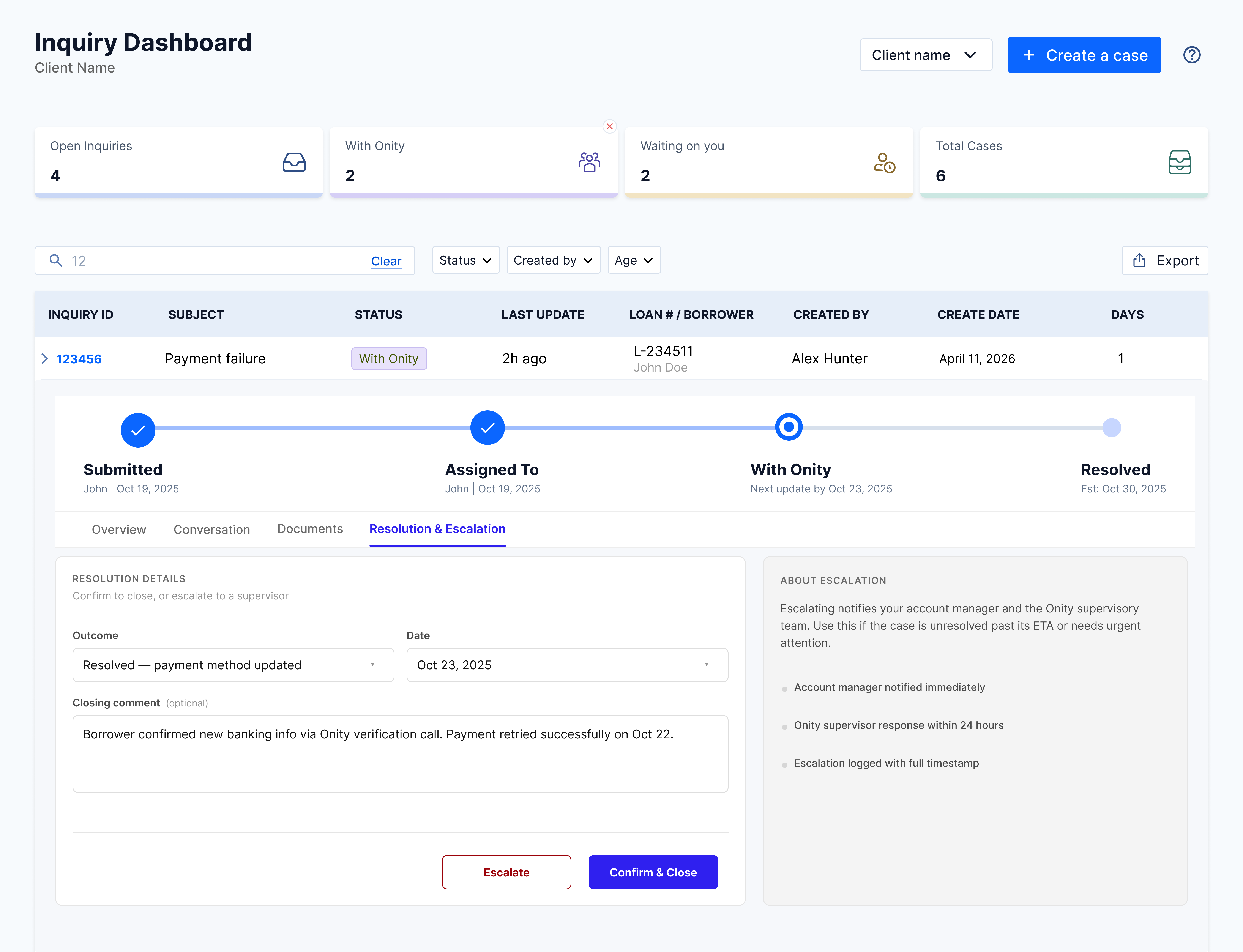
Case resolution and feedback

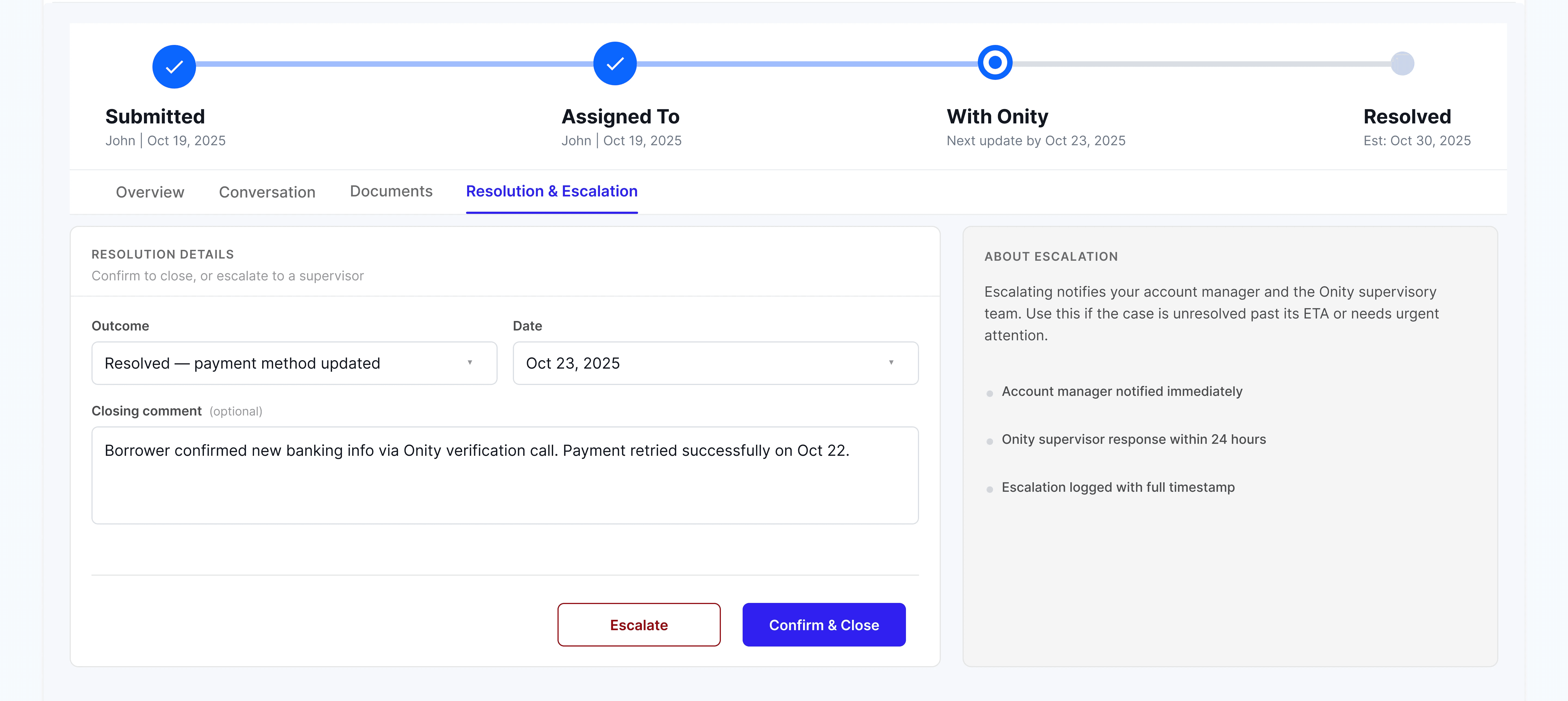
Why: Clients didn't have a clear way to confirm a problem was fixed or to ask for extra help. I added a section to let users officially close a case or send it to a manager if it needs more attention.

This gives the client control over finishing their work. The rating system also lets the team know if the client is happy with the service they received.

User Control · Feedback Loops
Resolution and Escalation tab showing Resolution Details with an Outcome dropdown, date field, closing comment, and Escalate plus Confirm and Close action buttons, next to an About Escalation help panel
Final Design

The full picture, tab by tab.

Four states of the expanded case-detail flow as a client moves through it: opening the case to see the overview, reading the conversation, attaching documents, and finally resolving or escalating. The dashboard chrome stays constant; only the inner panel changes with the active tab.

Validation

Did it work?

The project is in development, with the team using a sprint-based approach to build the MVP first, focused on the most important tracking features before adding more complex tools in future updates. To pressure-test the direction, I ran usability tests with a clickable prototype. The feedback from mortgage clients and account managers showed these changes will have a meaningful impact on daily work.

90%

Success in status tracking

During testing, almost every user was able to find the exact stage of their case on the first try without any guidance.

Zero

"Lost" conversations

Users reported that having the chat and files tied directly to the case made them feel more confident about the history of the request.

12 hrs

Saved per analyst per week

Our tests confirmed that the portal's live data is accurate enough to replace these manual reports entirely.

Post-launch

What I'll monitor after launch.

Once the MVP is live, I'll track these three areas to confirm the portal is doing the job. Each one ties back to a concrete change in behavior, not a vanity number.

📉

Shift in communication

I'll monitor if "status update" emails decrease as portal logins increase to confirm users are trusting the dashboard for answers.

📤

Document task completion

I'll track how quickly clients upload requested files through the portal compared to the old email-in method.

📊

Self-serve reporting success

I'll measure how often the "Export" and "Filter" features are used to ensure account managers are successfully managing their company's full workload.

Retrospective

What I took from this.

Two layers of impact that don't show up in the metrics. The work that shaped how I designed it, and the patterns the team kept using after I shipped.

Impact on me

Designing a system of record means defending what doesn't get built.

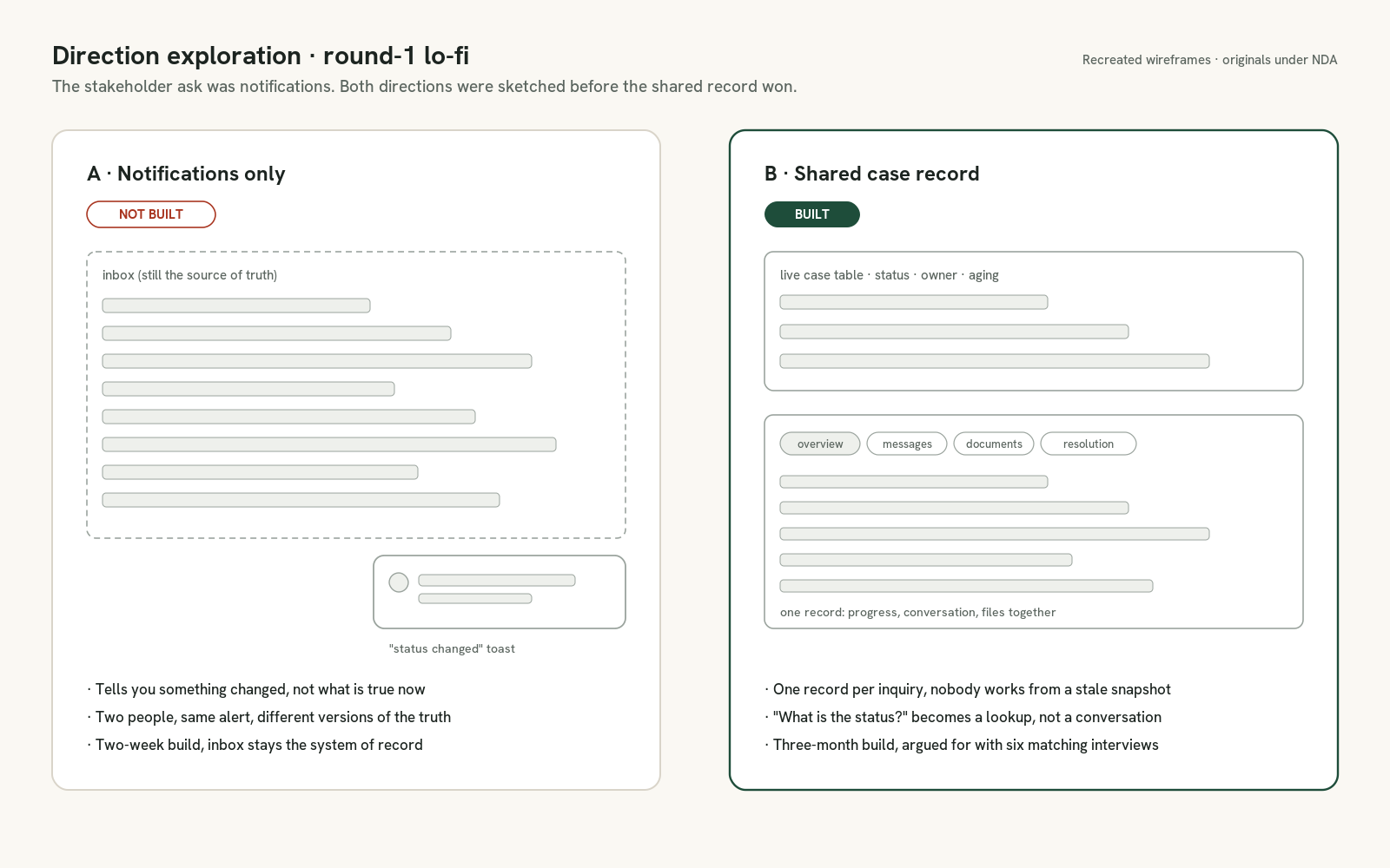
The first round of stakeholder asks would have stuffed every report, alert, and integration into one screen. Holding the MVP to four jobs, status, conversation, documents, resolution, took more meetings than the design did. It's the reason the prototype tested cleanly on the first pass.

  • 10 user interviews shaped the four-tab IA
  • 3 prototype rounds before usability testing
  • What I'd do differently: bring engineering into wireframe reviews two weeks earlier, the SLA logic surfaced late
Impact on process

The patterns left behind for the next portal.

This was the first case-management surface on Onity's mortgage platform, so the components and the research artifacts both became templates. The next team building a similar workspace started from the moves I made here, not from scratch.

  • Live case-table pattern, status chips, owner, aging, added to the internal design system
  • Progress-tracker component reused on the Loan Deboarding portal
  • Interview synthesis template now used across the platform team