Evolving Dell's AI support from a cramped chat box into a full-screen workspace where 12+ APIs, source-tagged answers, and the sales portal's tools all sit under one conversation. Ticket volume fell 55%, self-serve adoption hit 92%, and reps finally trusted what the AI said.
Dell employees were stuck inside a cramped chat window that surfaced shallow AI answers and hid the platform's real capabilities. Checking a single order meant opening four other tabs, then pinging a teammate anyway.
IntelliAssist 2.0, a full-screen AI workspace that unifies 12+ APIs, source-tagged answers, and the centralized sales portal into one place. Fewer tickets, more self-serve, and trust in what the AI says.
Senior Product Designerresearch, IA, interaction, visual
Dell Technologies2 PMs, 8 engineers, 2 designers
8 monthsdiscovery through pilot launch, 2024
Figma · Mural · UserTestingpilot telemetry, post-launch surveys
If you only read three paragraphs, read these. Problem, change, and results in about a minute.
Dell employees worked inside a cramped chat box that surfaced shallow AI answers and hid the platform's real capabilities. Checking a single order meant opening four other tabs, then pinging a teammate. Adoption stalled and support tickets piled up.
I rebuilt IntelliAssist into a full-screen AI workspace that unifies 12+ APIs, source-tagged answers, and the sales portal's tools under one conversation. Reps see where each answer came from, trust what they read, and stay inside one surface.
Ticket volume dropped 55% across enterprise support. Self-serve adoption hit 92% on the new workspace. Task completion ran 78% faster vs. 52% on the legacy chat. 85% of pilot users reported easier access to critical tools.
Dell's enterprise sales teams needed answers about orders, configs, and customer history during live conversations. But they were stuck inside a cramped, outdated chat interface, toggling between four to six systems to assemble a single response. Tickets piled up at the support desk, AI adoption stalled, and reps quietly defaulted to bookmarks and pinging teammates. The goal was to unify scattered tools into one full-screen workspace that could replace the chat-plus-tabs workaround with a single source of truth.
Three problems showed up at the same time. The chat surface was too small for real work. The AI underneath gave generic answers that no one trusted. And the tools that could have helped were spread across a portal nobody could navigate. The redesign had to fix all three.
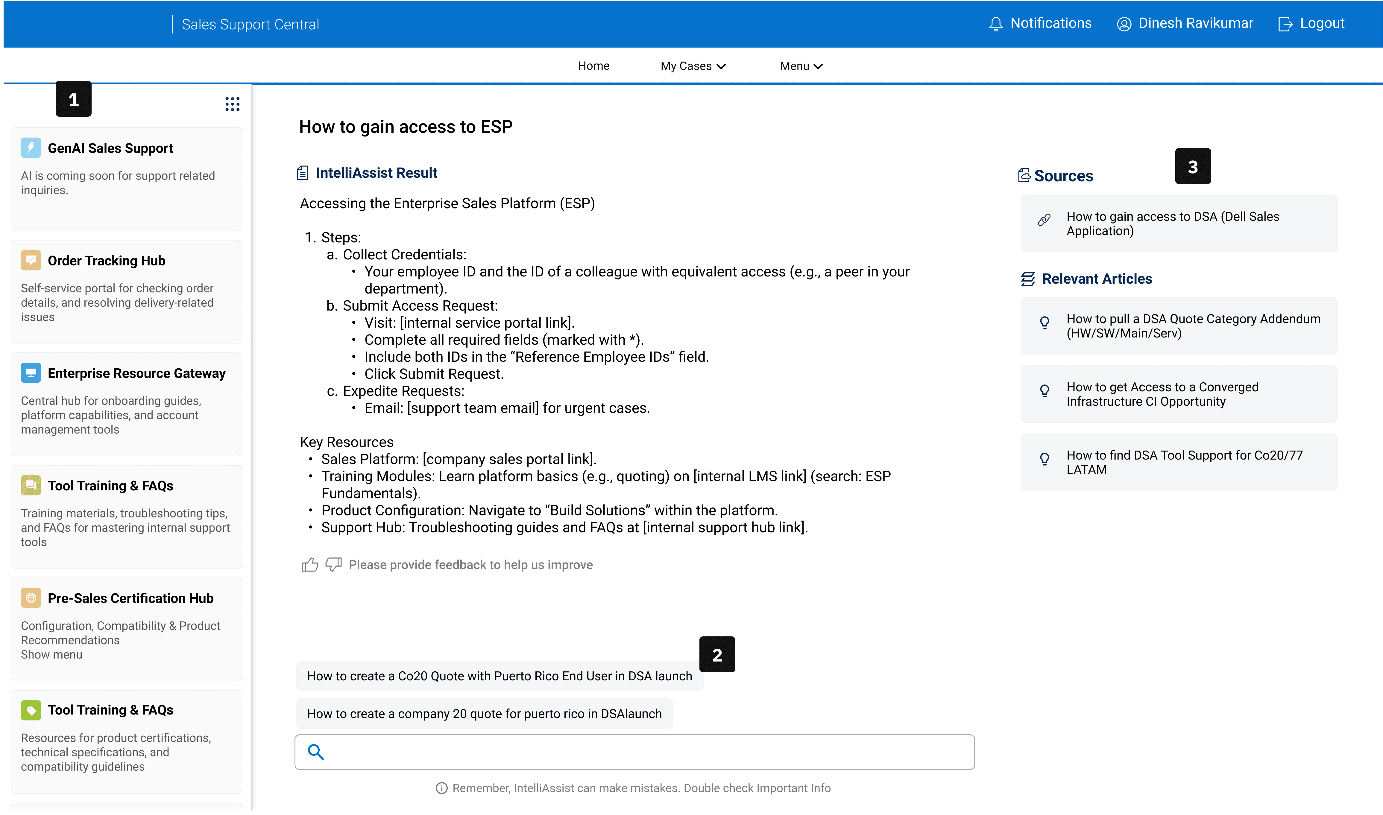
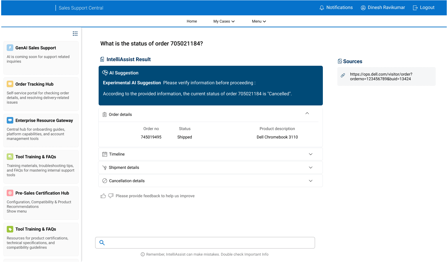
A full-screen AI workspace that replaces the cramped chat with prompt suggestions, source-tagged answers, and the sales portal's tools sitting directly underneath the conversation.
The business needed a stable platform to integrate new AI capabilities and unify sales tools. Without it, employees faced disjointed processes, errors, and stalled enterprise-wide AI adoption.
Across user interviews, a clear pattern emerged. Employees lacked confidence in the tool, found it slow to navigate, and rarely discovered features on their own. The result was low adoption, fragmented workflows, and delays in customer resolution.
The AI gave surface-level details without supporting context, related information, or follow-up questions. Users couldn't tell what to trust.
"The chatbot gives generic answers. I can't trust it." Sales Representative
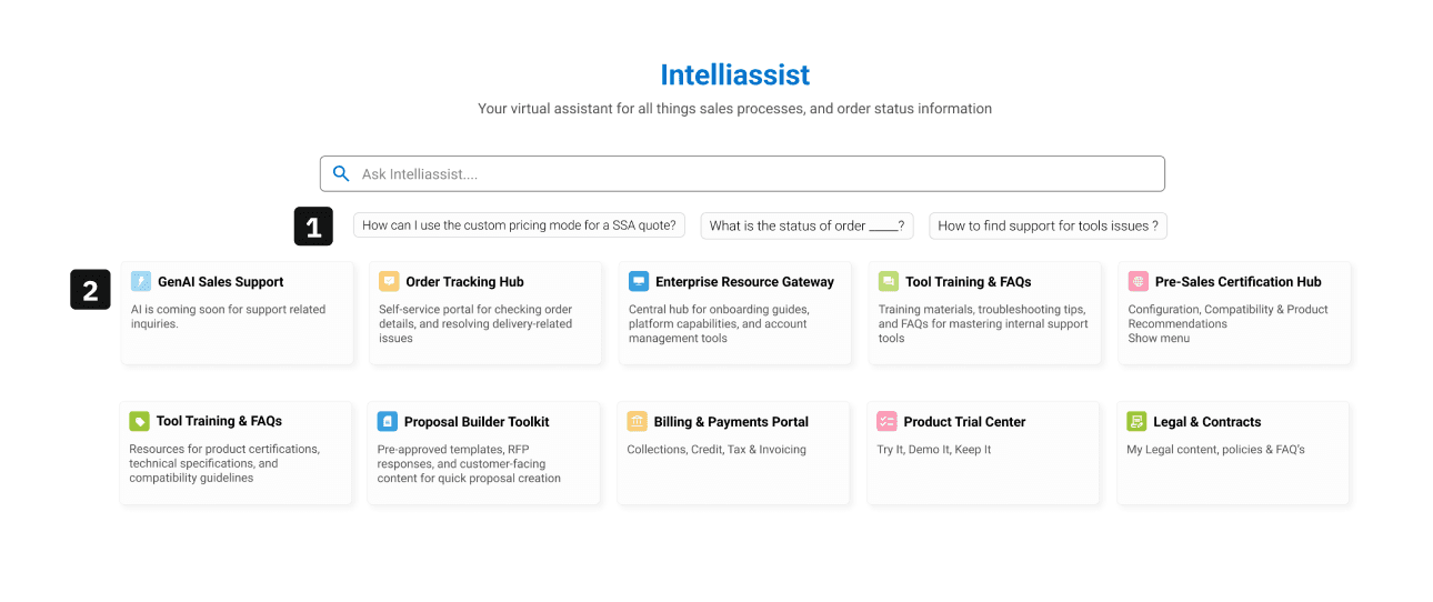
The sparse landing screen failed to highlight the AI's full capabilities. Feature discovery was low, and employees defaulted to peer-dependent learning.
"I have to ping a teammate to get the right resource." Project Manager
Search was so slow that users had quietly stopped using it. Bookmarks were faster, even when stale. The tool was being routed around, not used.
"I just use bookmarks. Searching takes too long." Data Engineer
I reframed the challenge around three principles. Every design decision, from role-specific prompts to source-tagged answers, was built to shift behavior, boost adoption, and reduce support dependency.
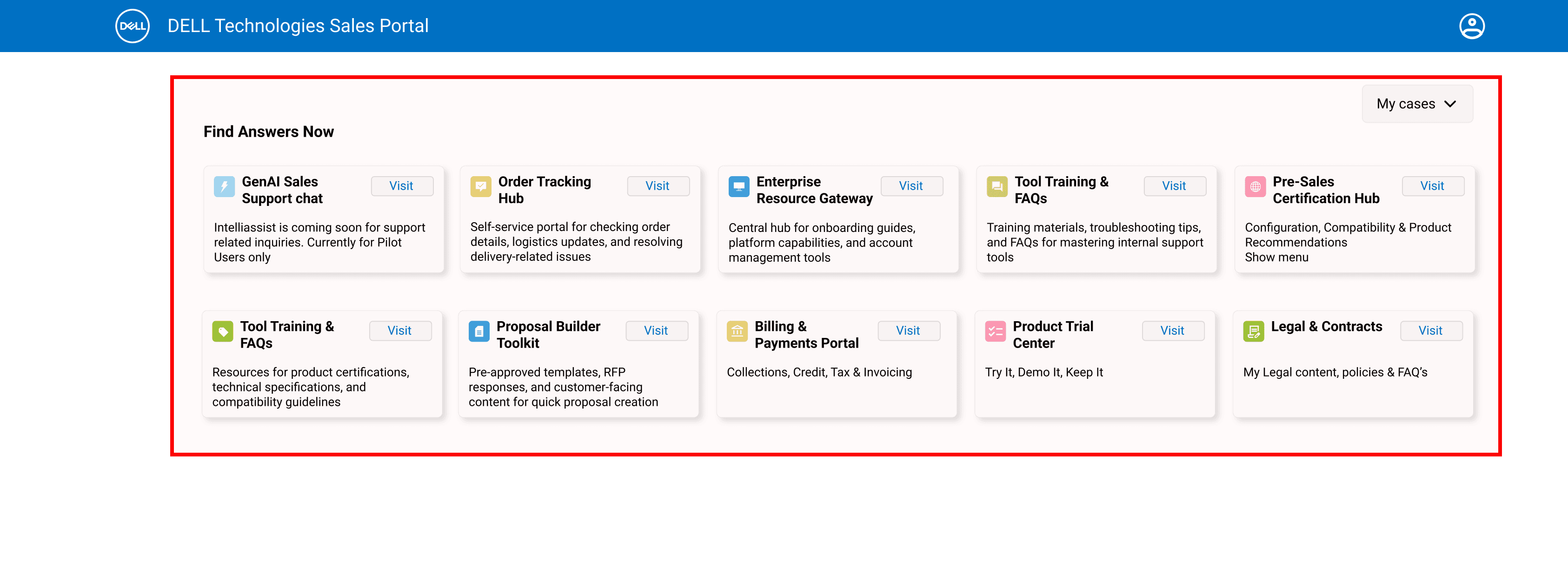
Self-serve tiles were prioritized at launch to ease adoption, with plans to phase them out as AI usage grows. Balancing familiarity with long-term efficiency, not picking one over the other.
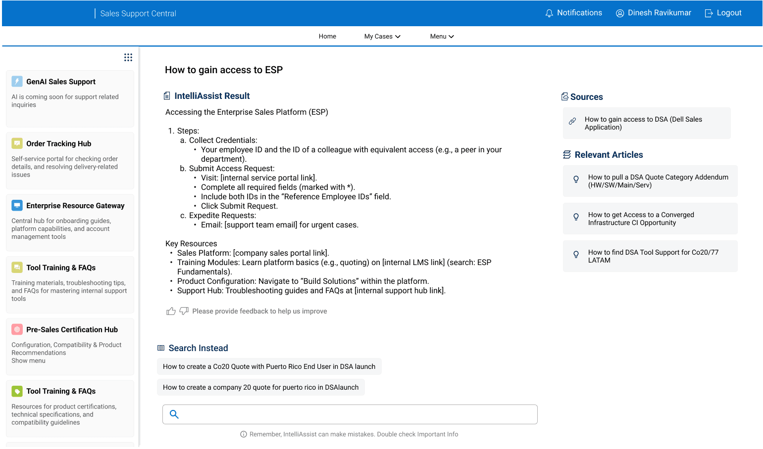
The shipped IntelliAssist 2.0 wraps a full-screen AI chat in a workspace that holds context. Underneath, five interface decisions made the new pattern work for employees who'd been burned by the old one.
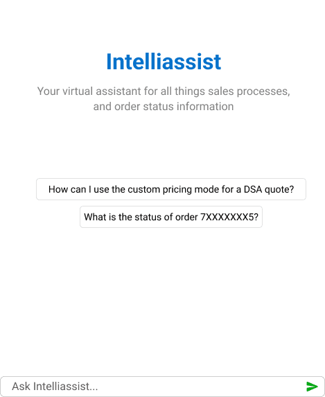
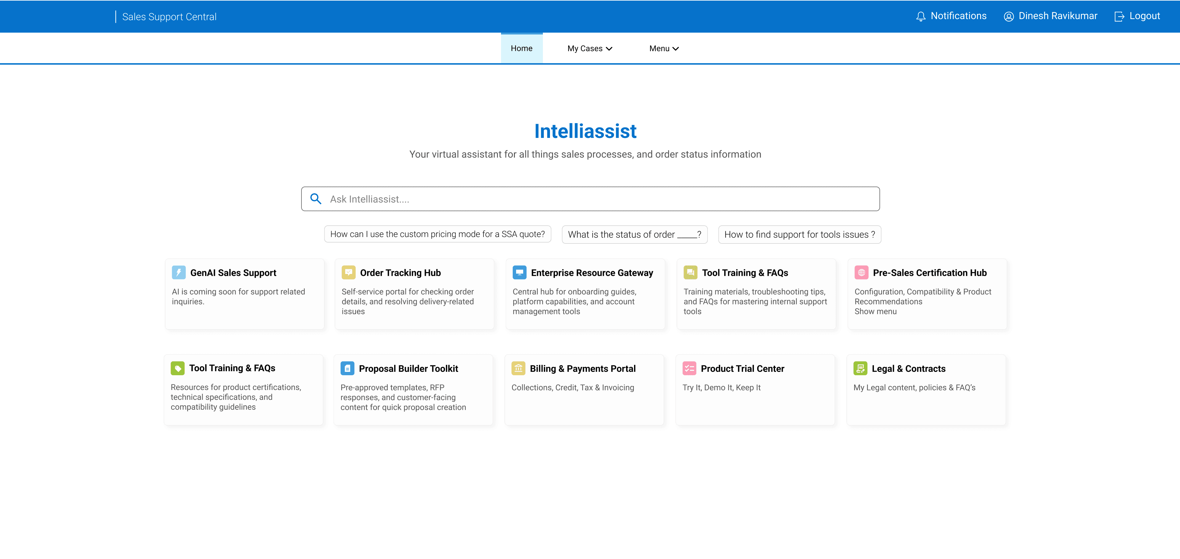
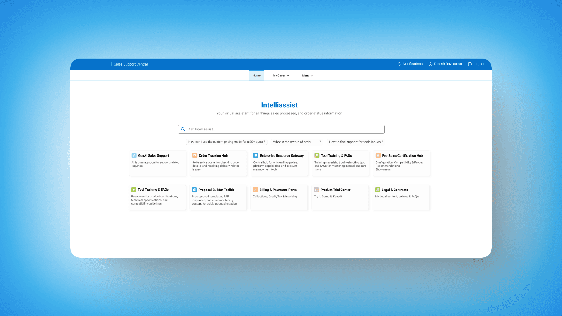
User testing revealed hesitation around what to ask. I introduced role-specific prompts to reduce friction, guide first-time use, and highlight AI capabilities. These soft nudges boost perceived relevance and support progressive discovery, all without overwhelming the interface.
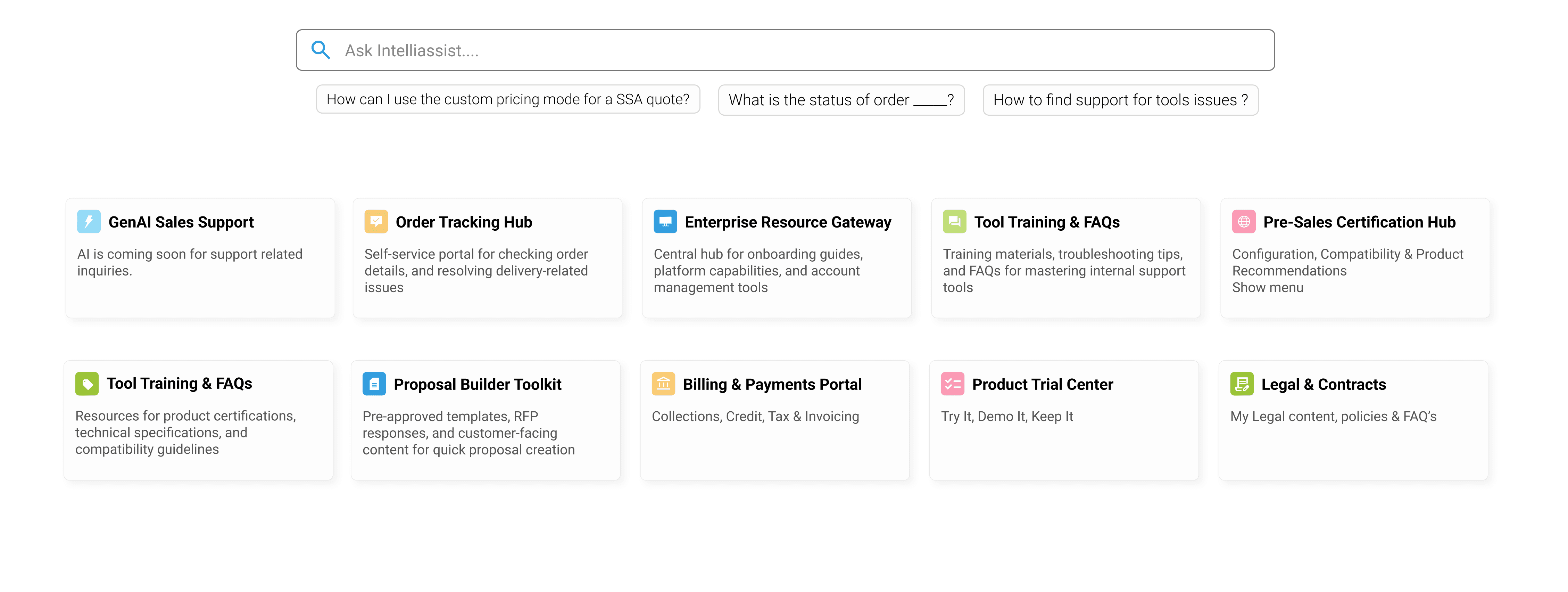
To ease adoption, I retained the familiar card layout from the legacy interface. This preserved mental-model continuity, reduced cognitive friction, and helped users feel more in control. A small but intentional decision that improved learnability and supported a smoother behavioral transition to the AI workflow.
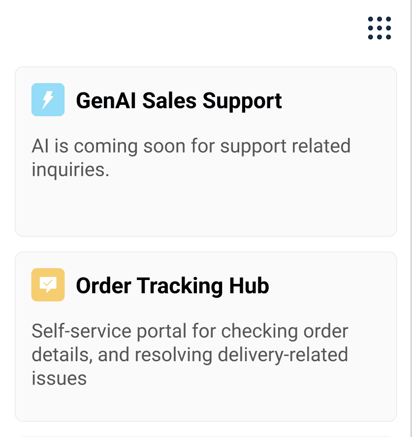
To give users a sense of control, I added a collapsible sidebar so they could self-navigate when the AI response fell short. It acts as an escape hatch, offering a familiar fallback path that boosted confidence and supported smoother adoption during the transition to AI-assisted workflows.
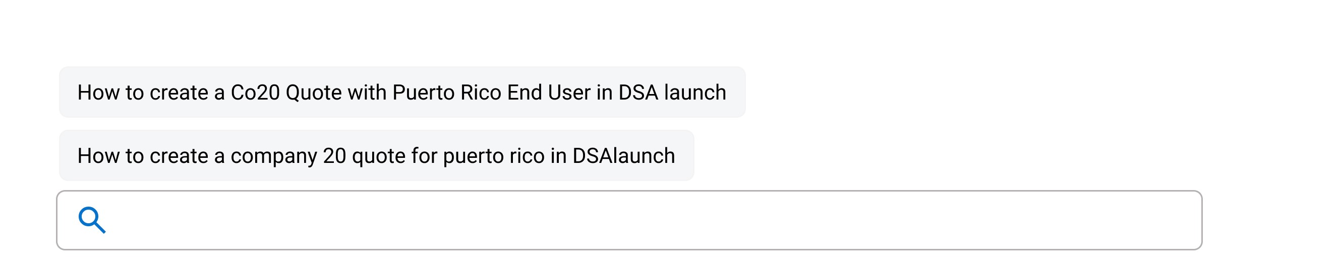
These contextual suggestions help users reframe queries or explore related topics when AI responses fall short. They reduce blank states and reinforce conversational UX patterns, making the AI experience feel more responsive and guided.
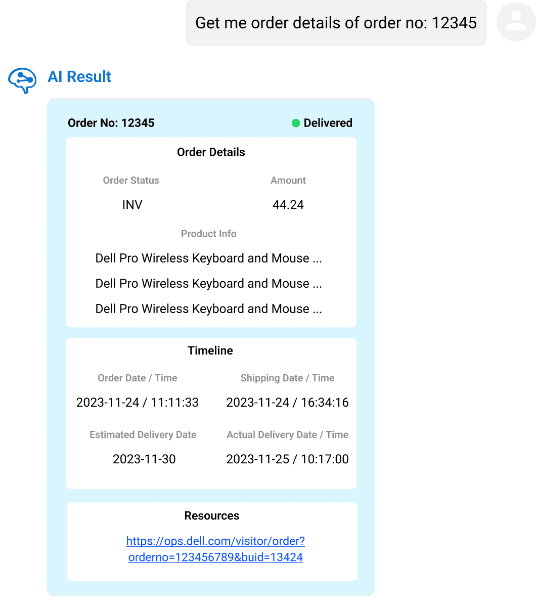
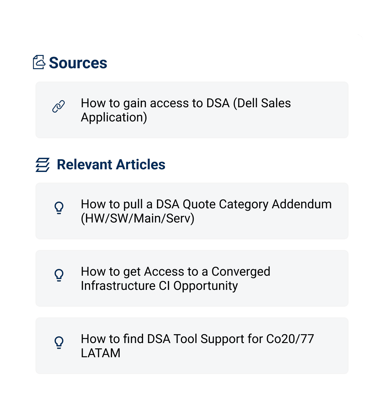
I added visible sources and related links to increase the credibility of AI responses and help users feel confident in what they were seeing. This supports AI explainability, gives users a way to independently validate results, and builds trust without dependence, especially important during early AI adoption.
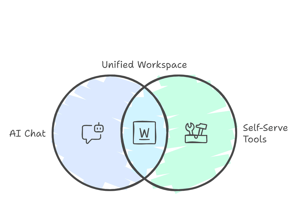
The five decisions added up to one workspace. A full-screen AI surface that holds context, surfaces prompts, attaches sources, and keeps the legacy self-serve tools one click away. This is the shipped state, the same view a Dell sales rep sees on day one.
"This tool transformed how our teams operate. Finally, the right resources are at their fingertips, exactly when needed."Director, Operational Intelligence · IntelliAssist 2.0 launch retrospective
Due to tight launch timelines, we validated critical workflows with pilot users, iterating rapidly on feedback like confusing navigation and unclear AI responses. The numbers below come from pilot telemetry and post-launch surveys.
Centralizing AI chat, self-serve tiles, and sales tools cut redundant tasks like order tracking by 40%, letting employees focus on high-value work.
Integrated sales portal resources eliminated daily platform-switching for 72% of pilot users, freeing up time for higher-impact work.
Feature discovery rose by 55%. 85% of users reported "easier access to critical tools" once the new workspace was live.
The constraints on this project (tight deadlines, leadership-driven requirements, ambiguous AI capabilities) weren't problems to solve. They were the conditions of the work. Three things I learned about designing inside them.
Strict leadership requirements often mirrored hidden user needs, like faster workflows.
With tight deadlines, I prototyped only critical flows first like order tracking, then iterated post-launch.
Letting go of "perfect" features like custom animations freed time to solve bigger issues like AI response accuracy.
Two layers of impact that don't show up in the metrics. The work that shaped how I designed it, and the patterns the team kept using after I shipped.
Adoption didn't move when the AI got smarter. It moved when reps could see where each answer came from. Source-tagging, prompt suggestions, and recovery paths did more for behavior than any single model improvement. That changed how I scope every AI feature now.
IntelliAssist 2.0 was the first full-screen AI surface at Dell. The patterns we shipped became the reference for every team that followed, so the next AI projects didn't have to rediscover what worked.