A full IA rearchitecture of Dell's Intelligence Nerve Center as the sole UX designer on the project. Three structural moves cut click fatigue, a visual refresh aligned the platform with Dell's brand, and accessibility checks were baked into the process. Findability lifted 40%, misclicks dropped 50%, all grounded in three rounds of research.
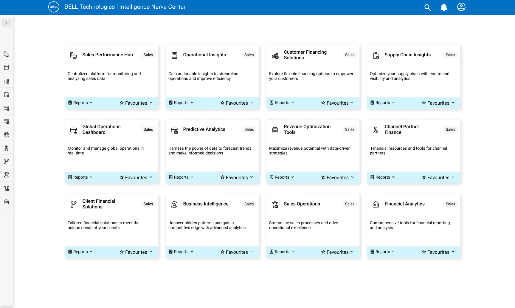
Dell's Intelligence Nerve Center, an internal platform for 30,000+ employees, had grown cluttered. Navigation forced too many clicks, the visual language felt dated, and employees relied on memorized routes to reach reports they used every day.
A full IA rearchitecture as the sole UX designer on the project. Three structural moves cut click fatigue, a visual refresh aligned the platform with Dell's brand, and accessibility checks were baked into the design process, all grounded in three rounds of research.
Sole UX DesignerIA, research, interaction, visual
Dell Technologies1 PM, 4 engineers, 1 designer (me)
5 monthsthree research rounds through launch, 2022
Figma · OptimalSort · Mazecard sort, tree test, usability test
If you only read three paragraphs, read these. Problem, change, and results in about a minute.
30,000+ Dell employees relied on INC daily for sales tools, operational reports, and analytics dashboards. Navigation forced too many clicks, the visual language felt dated, and people had quietly stopped using the menu in favor of personal bookmarks.
I led a full IA rearchitecture as the sole UX designer. Three structural moves cut click fatigue: tile-based nav with in-tile report dropdowns, a persistent side rail with Favorites, and color-coded categories. A visual refresh aligned the platform with Dell's brand.
Findability lifted 40%, misclicks dropped 50%, monthly active users rose 20%, and post-launch satisfaction reached 90%. The tile-based nav and Favorites patterns shipped became reference work for adjacent internal tools at Dell.
30,000+ Dell employees relied on INC daily to find sales tools, operational reports, and analytics dashboards. But the navigation had grown cluttered, the visual language felt dated, and employees relied on memorized routes (or browser bookmarks) just to reach the reports they used every day. Misclicks were common, adoption was flat, and the platform's slowness rippled into every team that touched it. The goal: rearchitect the IA so people could find what they needed without memorizing the menu.
I was the sole UX designer on the project. The brief: modernize the look and feel, make the platform scalable for future growth, and most importantly, make it easier for employees to access the tools and reports they need every day.
Beyond the business brief, I set four priorities for myself going into the project, to keep the redesign honest about user needs, not just stakeholder asks.
"Honestly, it's like finding a needle in a haystack trying to find the right report. It's beyond frustrating."participant, user interview
To understand what was actually breaking for users, I ran three rounds of research, qualitative depth (interviews + contextual inquiry) and quantitative validation (a wide survey). Triangulating across methods kept the synthesis honest.
In-depth interviews with nine individuals across roles and experience levels. The goal: get specific pain points, desired features, and the actual perception of INC from people who used it daily.
"Honestly, it's like finding a needle in a haystack trying to find the right report. It's beyond frustrating." participant, user interview
Volume of information without clear organization. Users felt buried.
Locating specific reports or tools was the most-cited pain point.
The visual language was perceived as dated, created a poor first impression.
People wanted dashboards and views tailored to their actual roles.
Beyond interviews, I observed users in their natural work environments. Watching the actual click paths exposed friction patterns that interviews alone couldn't surface, the workarounds users had built without realizing it.
Multiple clicks and detours just to complete the most common tasks.
Users had built their own systems to bypass the platform's limitations.
The info shown wasn't always relevant to the user's role or current task.
After the qualitative phase, I ran a survey reaching thousands of INC users, to validate the patterns I'd seen in the small-sample work, and to surface anything that only showed up at scale.
A significant portion found tool and report labels confusing or stale.
Confirmed redundant reports and tools, created unnecessary confusion.
Slow pages and reports were directly impacting productivity.
Available analytics tools were insufficient for many users' needs.
Ten-plus insights, three methods. I ran the findings through an Ishikawa diagram and a prioritization matrix to identify what was actually causing the most pain, versus what just felt loud. Two root causes emerged.
Most user frustrations traced back to two root causes, both structural, both addressable through redesign:
The excessive number of clicks required to navigate and access information made every task feel cumbersome and slow, even for experienced users.
The outdated visual design, weak hierarchy, and inconsistent layout left users disoriented and undermined the platform's credibility.
Employees needed quick access to a small set of reports they used every day. The platform forced them through three to five clicks to reach each one, every time. Familiarity didn't help because the structure itself was the problem.
Sales reps and analysts knew where their reports lived but still had to walk through the same nested menus daily. The interface treated every report as equal weight, surfaced nothing based on what people actually used.
"The number of clicks needed to reach the report slows me down. It disrupts my workflow and feels inefficient, even though I'm familiar with the site." Matt, Data Engineer, Dell
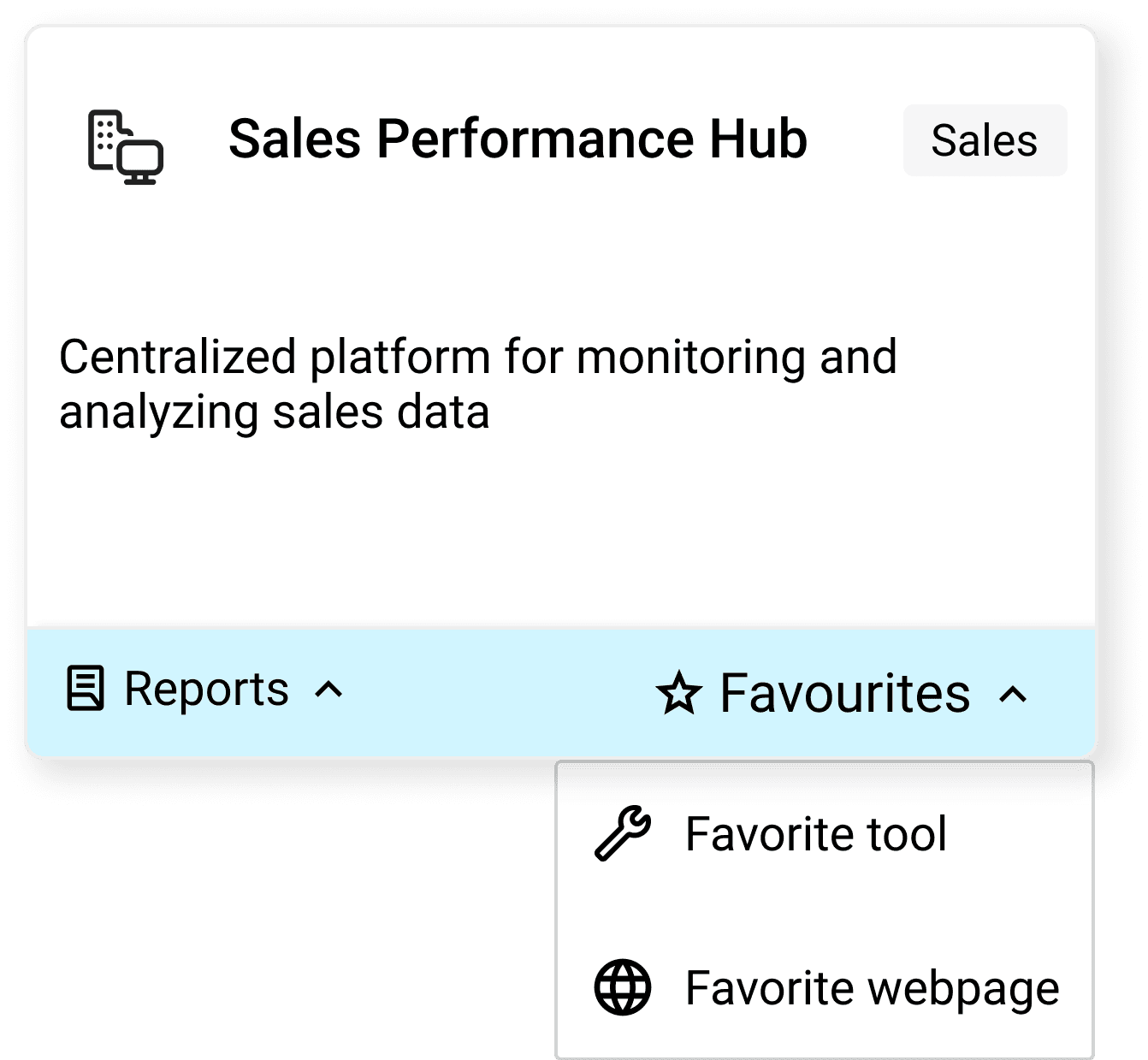
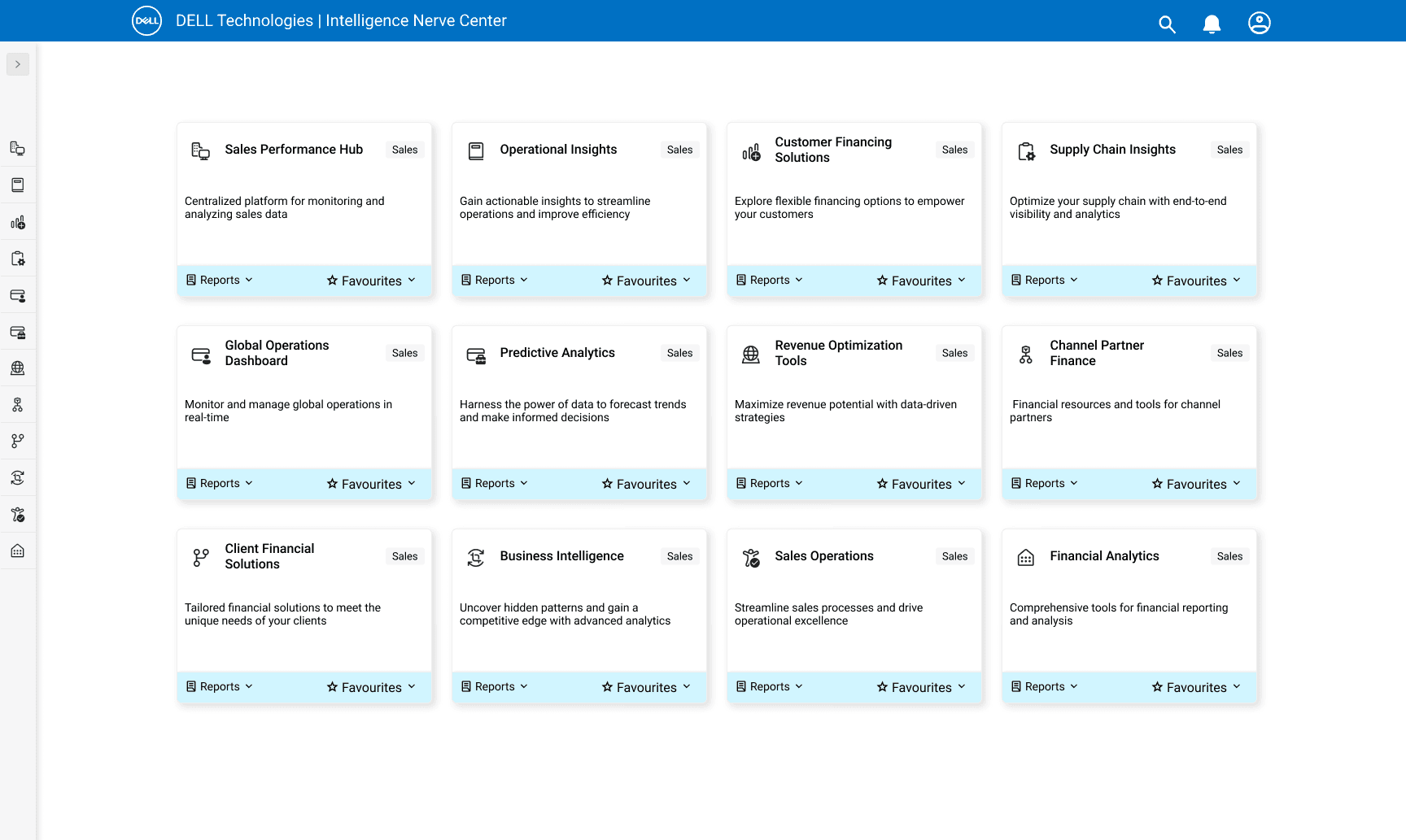
Users mark frequently-used reports and tools as favorites. The home tiles then surface those favorites as one-click destinations, bypassing the menu entirely. Workflow efficiency improves because the steps required to reach critical information drop dramatically.
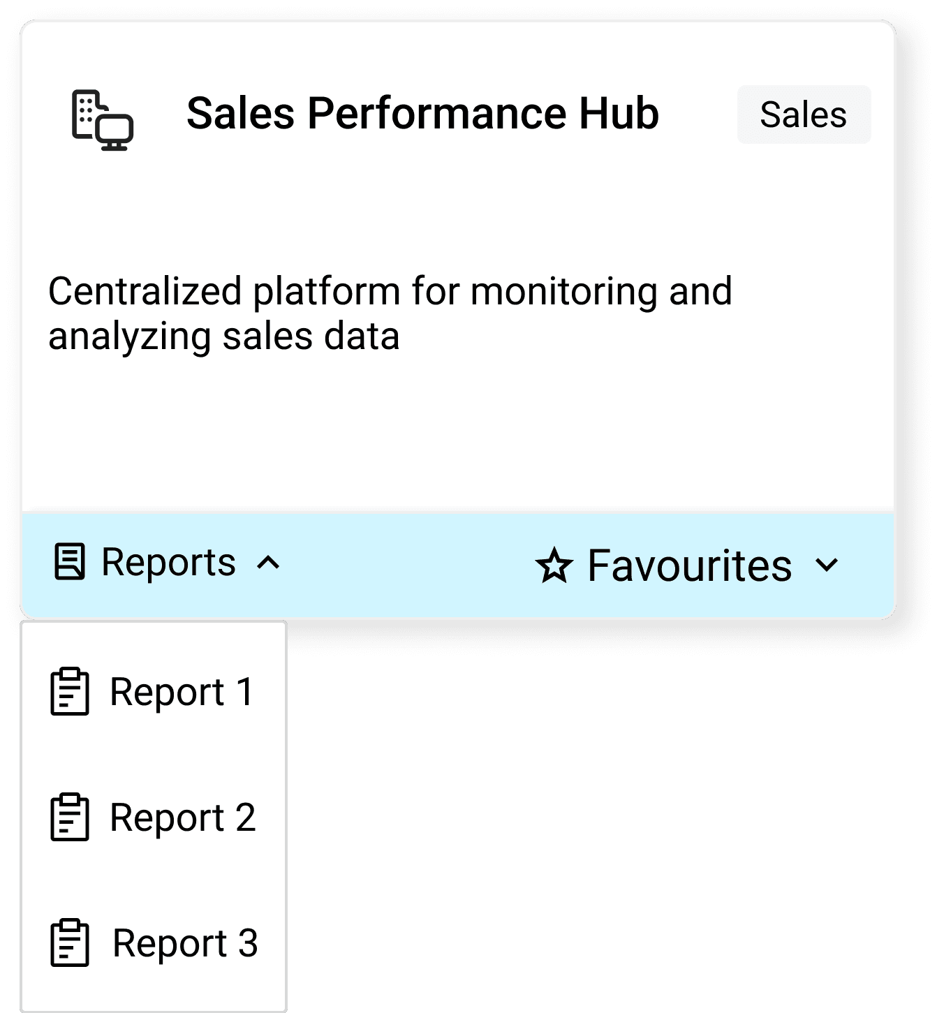
Beyond Favorites, each home tile gained a Reports dropdown that exposes the underlying reports list. Users jump straight to a specific report from the home screen, no need to open the full Reports page first. Fewer clicks, less context switching.
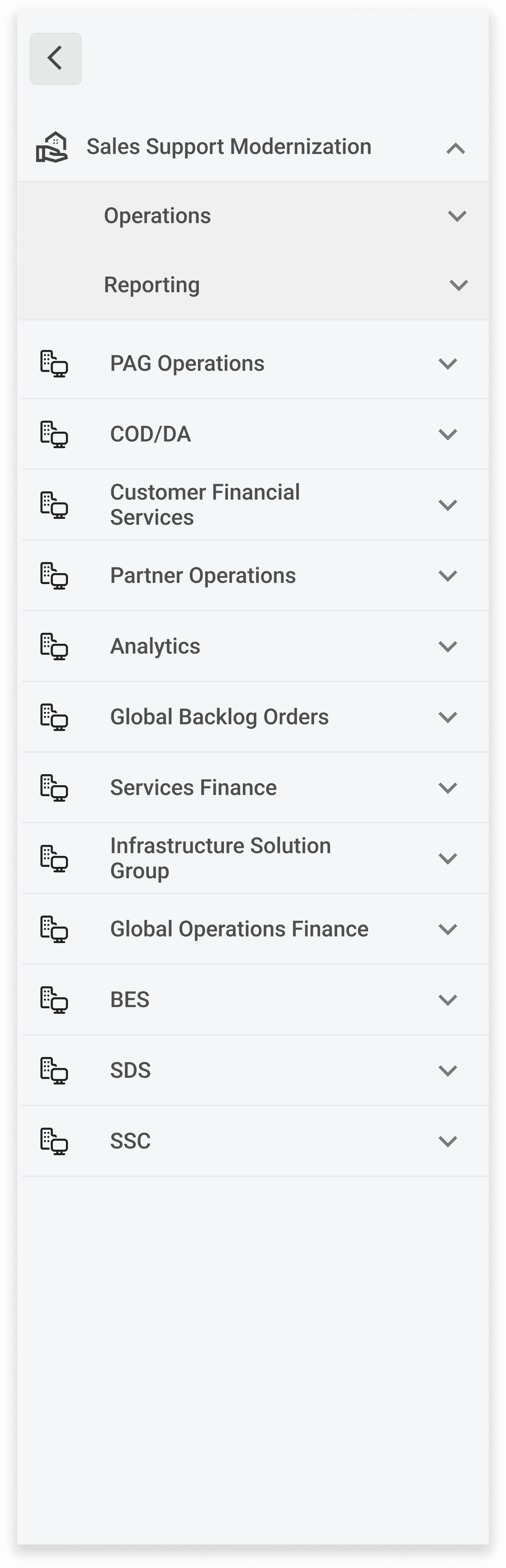
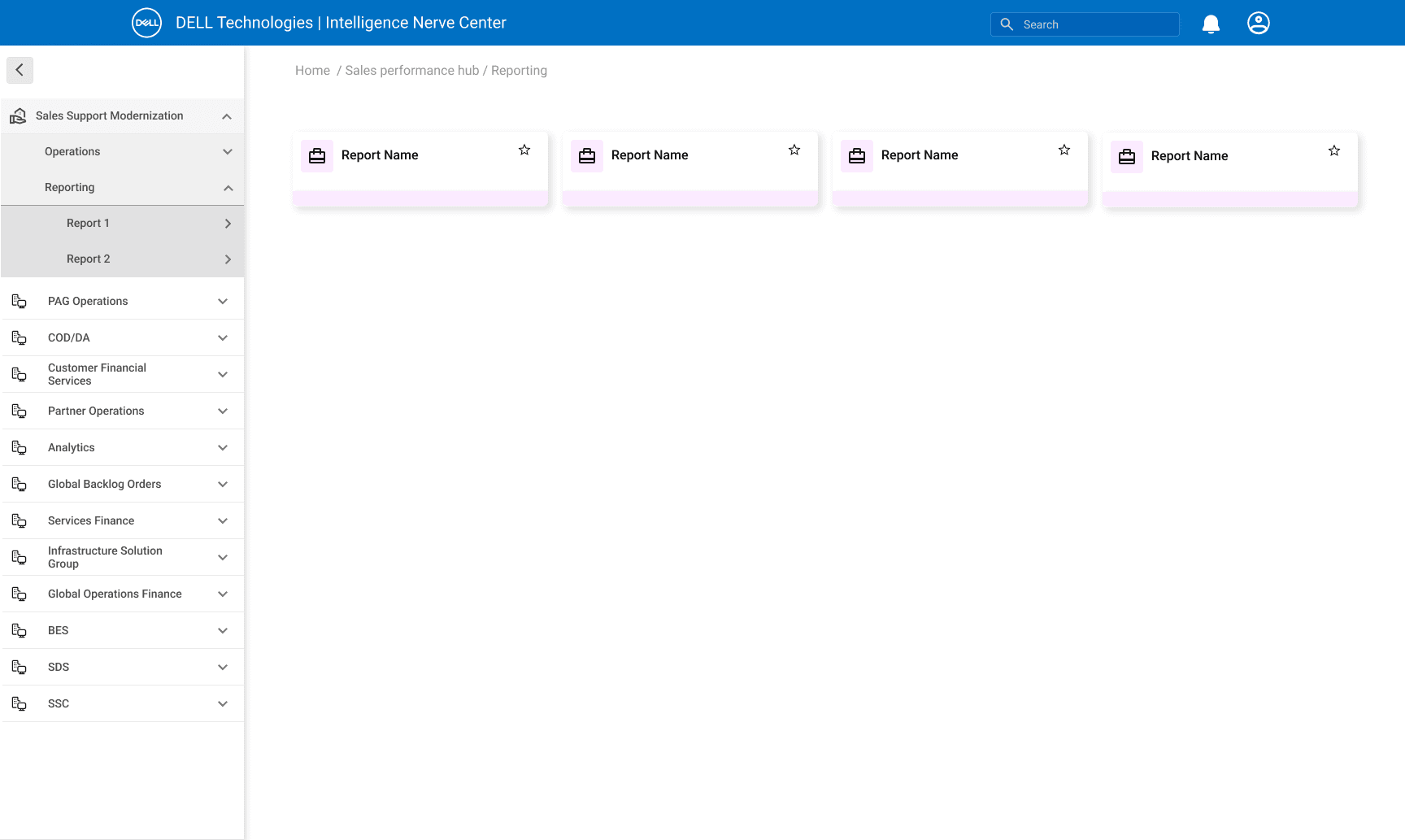
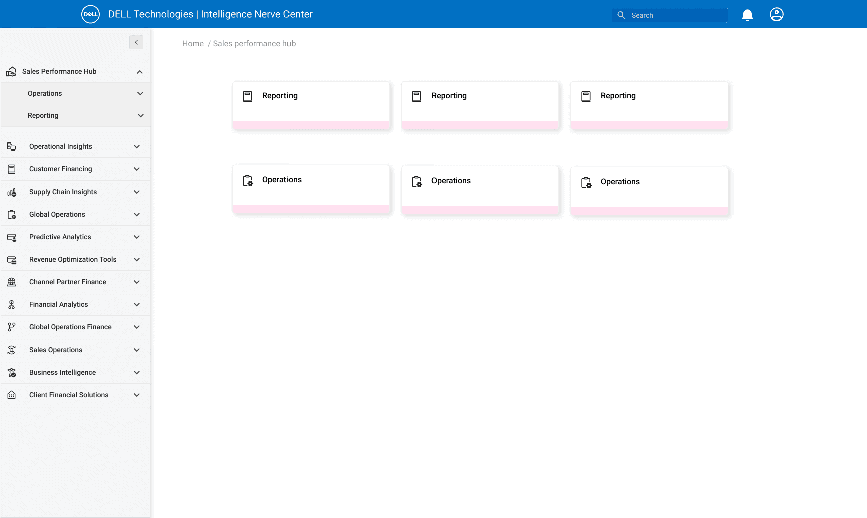
A persistent side nav lets users move to any section from any page in two states, a compact icon-only rail (default) and an expanded view with full category names and sub-items. No more backtracking through breadcrumbs to switch context.
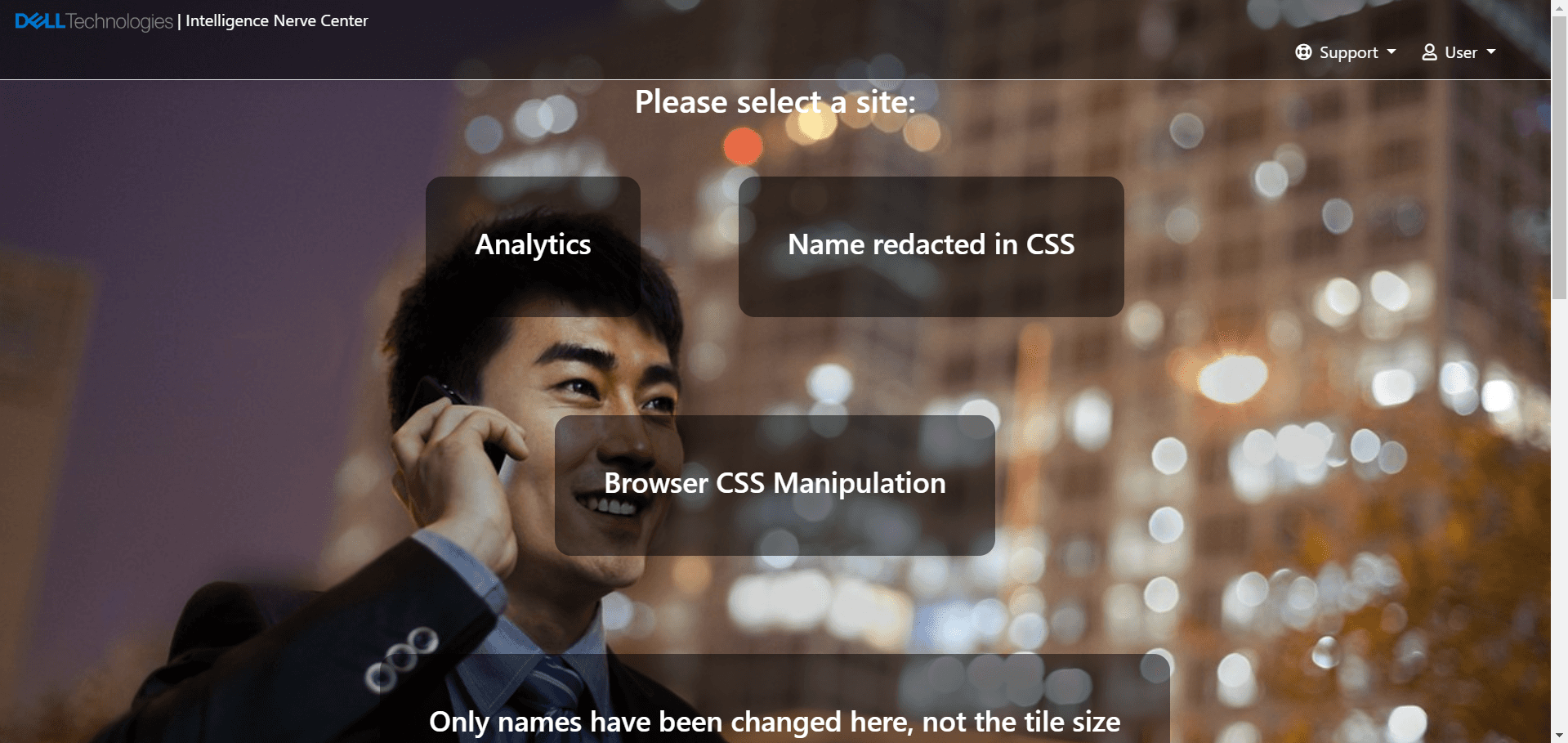
The platform's visual language was a generation behind Dell's brand. An image-heavy background fought with the foreground content. Tiles all looked the same, no visual cues for which category you were in. Employees felt the platform was beneath the company.
Internal tools often get the leftover budget for visual care. But the people using them every day form an opinion about how seriously the org takes their work, and the INC interface was telling employees the answer was "not very."
"This UI needs a modern refresh that reflects our brand and showcases our capabilities, with intuitive navigation that can grow with us." Gayathri, Director, Dell
Stripped the image-based background that was competing with foreground content. Replaced it with a clean, neutral surface so essential info becomes the focus. Background images often fight with what's in front of them, removing it sharpens the entire visual hierarchy.
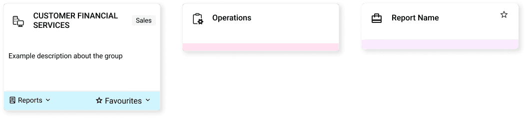
Replaced the uniform layout with a tile-based system where each sub-organization gets a unique tile color and category icon. Users now identify their section at a glance, Customer Financial Services in one accent, Operations in another, and so on. Visual distinction without extra labeling.
Accessibility wasn't a final-stage check. It lived inside the iteration loop. Every design pass went through contrast, keyboard, and screen reader scrutiny. The blue color used for some interactive states didn't pass contrast on the first iteration; I adjusted before it ever reached engineering.
The pieces (Favorites, Reports dropdown, side navigation, refreshed visual language) assembled into a cohesive product. Three views from the shipped redesign showing how the structural and visual changes work together in practice.
Two layers of impact that don't show up in the metrics. The work that shaped how I designed it, and the patterns the team kept using after I shipped.
Employees had stopped using the menu and were navigating by bookmarks. Re-earning their trust meant proving the new structure could outperform a personal shortcut, every single time. That's why we validated the IA three times before pixels, not after.
INC was the most heavily used internal surface at Dell, so the IA decisions and the research artifacts both became templates for adjacent platforms. Teams that owned other internal tools pulled directly from this work instead of standing up their own studies.